Saturday, 27 March 2010

OUR EVALUATION!!!!


Written Evaluation. (An essay of what is discussed in the video!)

1. In what ways does your media product use, develop or challenge forms and conventions of real media products?

After researching and analysing existing music videos of the same genre as ours, we were able to see what conventions were needed for our video.

We included studio shots of the band/singer that we interspersed with shots of several characters who made up our main narrative. We had multiple narratives, depicting 7 sets of characters; each of a different age and in a different location. We therefore, challenged our conventions by including more than one narrative.

We made sure that the singer addressed the audience by singing directly into the camera. We found this to be a typical convention of many music videos; whereby it allows the audience to establish a relationship with the singer.

We wanted the narratives of each of our characters to be shown clearly to make it recognisable for the audience. I think we achieved this by having strong, easy to follow narratives. When analysing existing music videos e.g. Billy Joel – Uptown girl, we took ideas on board to help with our own video. We did however break conventions by adding in a predominant performer not performing in the narratives that were featured in the video but appearing in a solo studio based scene as apposed to being a part of the narrative, which is what is normally done in a typical pop video. Throughout the video, synchronisation was used in regards to editing in time with the beat, along with dance moves and lyrics of the song being adapted to the music. This was essential for our video as accuracy is an essential factor.

Because our video was of the pop genre it was important to take into consideration the mise-en-scene that we would use for each of the characters performances. As we had a vast range of characters; each telling a different story, it was important that the attire of the characters was correct and in keeping with their task.

2. How effective is the combination of your main product and ancillary text?

Before creating our ancillary texts we looked at a number of existing products, created to go along with other music videos of the pop genre. There were some clear conventions that we decided to follow such as the song name, artist photos. We had to adopt a house style that would enable a theme to be carried across each of our products to create a clear and recognisable marketing package. We then came to the decision that a picture of the main singer would work well on the each of the products.

One obstacle we were faced with when creating our ancillary products, was creating a package that would attract a wide audience; as we hoped our music video would. It was a challenge to make the ancillary texts appeal to a wide variety of ages, and both to males and females. We did this by keeping each product simplistic but with bright colours, which stand out and share connotations of our chosen genre and dance music.

We wanted our products to convey similar stylistic features, as we understood the target audience would be the same for each. I think we succeeded in reflecting the genre of our video in our ancillary texts, whereby we used bright colours, and photos of the singers. I think that by adopting a similar house style for each of the products we proved that they were promoting the same product. For the advert and the digi-pak we used the same typeface and the same logo, again showing a link between the two.

3. What have you learned from your audience feedback?

Overall I think that our audience feedback has been very positive. Many of our choices made, in filming, editing etc have been praised and liked by those who have watched it, and I therefore think should be pleased with our final product. We set out to produce a music video that stood out from many other ‘‘pop’’ music videos, and I think we succeeded in achieving this by using multiple comical narratives, different mise-en-scenes, a studio character or artist, and a well-known song.

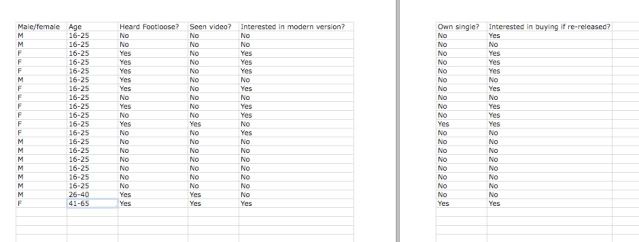
The range of characters was something we wanted the audience to enjoy and something that we decided to incorporate from the beginning. We wanted the audience to be able to relate to them as well as allowing us to appeal to a much wider audience. I think we have successfully managed to attract this wide audience and this can be supported by our audience feedback. The range of ages is something that helps us achieve this. We learnt through some of the feedback that by having an improved range of characters of extreme age or different ethnicities is might have been more successful in terms of censorship. In terms of locations, however, we limited with the type of actors available. I also think that given more time to create the video, we would have been able to include locations outside peoples homes; something that we wanted to include - evident in our original character listings and animatic. If the locations had been more easily accessible we would have been able to include the shots of a workshop, hairdressers, bar, classroom etc. providing us with a bigger range of mise-en-scenes.

The fast cut rate of our video was again something that we set out to achieve from our initial planning stages. We questioned our audience about this when it came to audience feedback; as we were not sure whether the cut rate worked. After gaining feedback, I think our choices involving the cut rate of our video were successful. We wanted the audience to keep watching each character, at first to establish who is who, and later simply to want to see what was going to happen next, and I think we accomplished this by using the fast cut rate not lingering on any one character at any time; this also means that the audience doesn’t get bored.

4. How did you use new media technologies in the construction and research, planning and evaluation stages?

For the initial research stages of researching towards our final product, we used popular and reliable sites like youtube.com, which allowed us to watch and analyse music videos. We also used online encyclopaedias which gave us reliable and beneficial information about our chosen track, ‘Footloose’, as well as information about the conventions and stylistic features of music videos, digipaks and advertisements – helping us when it came to create out final products. We also found the internet to be very helpful when researching online tutorials about how to use relevant software. We knew we were going to be using Final Cut Pro, and Adobe Photoshop during the production stages of our final products, so by researching tutorials and help forums on each program, it gave us a clearer understanding of how to use each. We had also never used the programs before, so the tutorials were essential.

When it came to the construction of our video, we used cameras, lighting and tripods. For the studio scene, in particular, we made use of the lighting and the HD camera –because we wanted these shots to stand out slightly, contrasting with the other shots of our characters dancing. I think we achieved this by having the background, completely blacked out. We experimented with zooms, close ups, long shots and mid shots. This gave us a bigger selection of shots to choose from when it came to editing. For the scenes outside of the studio, the lighting became quite a problem – we had to work around this by choosing rooms and locations that had very a good degree of natural light. However, this made the video inconsistent when it came to lighting, but because of time we had to work around this in post production by using video filters which corrected the colour and lighting of some of our shots. It is still however, evident that lighting was a problem.

When it came to editing, we had already learnt the basics by using the tutorials found online. It was the first time we had used Final Cut Pro. Synchronisation was a key factor in the editing for music videos, and we took this on board for ours – we had to make sure the cut rate was in time with the beat of the music, as well as making sure the lip-syncing and dancing was in time. We found this to be quite a challenge, particularly considering that it was a first attempt at making a music video. However, I think we achieved in making it in time with the music.

For the construction of the digi-pak and advertisement, we used Adobe Photoshop. We made use of layers, and many layer-editing tools that enabled us to create a professional looking advert and digi-pak. In particular, we used drop shadows, outer glows and inner glows – which all helped to make the features of the poster and digi-pak stand out.


Wednesday, 17 March 2010

Audience Feedback!!!


We asked people to watch our music video before interviewing them and asking them set questions, which will go on to help us evaluate how successful or unsuccessful our music video has been in meeting conventions and attracting our target audience etc.


After hearing what other people thought of our music video, and having them answer our questions, overall I think that we succeeded in achieving what we wanted. I think the feedback has been very positive, and many of our choices made for the video have been liked by those who have watched it. There are, however, certain things that we would have liked to have been better, and after hearing our audience feedback we can see what worked and what didn't. We will explain this in our evaluation!!! :D

Tuesday, 16 March 2010

Our Final Music Video - FOOTLOOSE!!! :)

Credit ‘‘Footloose’’ performed by Kenny Loggins (p) 1984 Sony Music Entertainment


It's taken us a while to upload it to our blog, because of technical problems... But it's finally uploaded!!!

Monday, 8 March 2010

Advertisement for our Digipak


We found, through research, the typical conventions of advertisements from the pop genre. We chose, again, to use bright colours as well as the black background that we had used in our digipak. We wanted the styles to be similar, so that they would appeal to the same audience.
The name of our artist is written in a large font across the top of the page - this was so that it stood out, as we considered it to be the most important part of an album or advertisement. We also found that similar advertisements used the same logo as that of the digipak design, so we incorporated this into our design.
We chose to write brief points, which highlight the main features of our digipak. This would appeal to the audience, making them want to buy it.
We thought the price of the album would be important for the viewers, as well as using the recognisable logos from well known stores that would sell our product.

We also included the record label and website information at the bottom of the page in a smaller font, as we found this was present in many existing advertisements.

How our Digipak is going to work...

For the inside of our digipak we decided on a similar colour scheme and to include silhouettes of the ''artist'' in stances representing dancing. We wanted it to look slightly different to the front and back covers, but still in keeping with our chosen genre - pop. We kept the original colour palette but enhanced the brightness. We used the same type-face for the artists name ''Kenny Loggins'', which we chose to position over both sides, cutting the name in half.

The CD will slot into the right side of the inside; acting as a flap or pocket. The left side will do the same job, but used for the dvd, or booklet.

Friday, 5 March 2010

Treatment

After researching and analysing existing music videos within the same genre (pop), and taking on board the various conventions. We collectively decided as a group that we would make a modernised version of Kenny loggins footloose. Using ideas of our own along with inspiration from other videos we have analysed will help us create a successful modernised version compared to that of the original.

This will result in us making a music video to fit the conventions of that of a pop genre. As the video was released in 1984 our video would have to be modernised significantly to the original version in regards to mise-en-scene and other conributing aspects. In regards to our editing the pace and timings will have to change throughout to fit the face paced song, with a variety of shots and editing tachniques ( cuts, fades etc) We will edit our video on final cut enabeling us to achieve this .

For our video we decided to have various mise-en-scenes, from kitchens/stables to our the main singer in a studio setting. This video is where we will need to consider the multiple narratives and characters, as we have collectively decided upon numerous of characters/narrative we have done this to make the video more convincing as we wanted the song to reflect peoples reactions when hearing the song, showing a true representayion of what it would be like for people listening to it in our video. This will result in us taking into consideration our video having many different mise-en-scenes which will vary with each character, not only with each individual character but also with the main peformer in a studio setting, this is a important part of the video as it’s the only break you have from the narration and is just merely a male standing and peforming which is in contrast with the upbeat/physical roles. This is where we will take full avantage of our editing skills to encorperate not only a wide range of characters to the fast pased beat but also a main solo peformer. The pace will be very upbeat like other music videos we analysed within the same genre as the pace quickens throughout the song the smaller the cuts of each character will become along with their actions becoming more intense (dancing etc) This will be done via editing we will do this to intensify the song and show the characters really getting into the music.

The lighting we will use will mainly be false due to most of our character being in indoor settings, this will come from the surrounding lights. The light will not be focused soley on a charater however as we want the setting to look as natural and spontaneous as possible, there should however not be a problem with lighting due to the windows etc. In regards to lighting of the studio we have decided to have the preformer against a black background, this is in contast to other vibrant scenes previously seen throughout the video. This will make the audience focus more on the perdominant peformer. The lighting will come from studio lighting focusing on the male peformer, however the light won’t be overpowering as it needs to keep in keeping with other shots. The variation may be too much if we focus to much on the solo performer.

The reason the treatment is was uploaded later than planned was due to technical difficulties. It had been completed before the uploaded date.

Saturday, 6 February 2010

Editing Complete

We have now finished the editing process and have completed our final music video. This was on schedule as we collectively allocated ourselves the deadline of the 4th February to have all editing completed.

Even though editing was completed to our allocated date we did experience difficulties. The main obstacle that occurred was the contrast of colour in scenes. Some of the scenes we had filmed had a blue tint present this was due to one of the cameras being set to night shot mode as apposed to day mode. As one of the cameras wasn’t set to the correct mode (night mode rather than day) it resulted in a contrast in colour throughout. Therefore the quality of the video was to a poorer standard, as a result a time consuming process had to be undertaken when editing the colour of scenes.

It can be easily established from the shot comparison bellow the colour correction in the shots from the left in comparison to shot on the right.

Friday, 29 January 2010

Risk Assessment


The risk assessment was carried out prior to undertaking the filming process, however due to technical difficulties uploading onto the blog it had to be uploaded at a later date than planned.

Reasons for the alterations to the storyboard from final video.

In regards to our animatic we made drastic variations to the order/scenes which we had collectively decided upon as a group. This was because we decided on more suitable alternatives for the video. Some have scenes we have originally storyboarded for e.g. the hairdressers which was not to a high enough standard of filming, this was due to the camera operator being present within the shot along with equipment e.g. tripods. This was because the mise-en scene of the establishment had lots of mirrors and as a result this proved hard when filming the scene. Therefore we as a group made the decision to cut the scene and replace it with another. Some other scenes we decided upon were also cut this was due to their being more suitable alternatives than originally planned for. This will result in there being a change from our storyboard to our final music video.

The reason the storyboard and animatic were uploaded later was due to experiencing technical difficulties. It had been completed before all other work e.g. digi-pak etc was created.

Wednesday, 27 January 2010

Digipak Cover - Latest Draft

After creating a template that is to the correct scale of a digipak - we are able to work with actual sizes; letting us know what works and what doesnt.

We spent longer creating a front cover that would meet as many of the conventions that we wanted.

The lights in the background are supposed to connote dancing, discos and up-tempo music - perhaps the business of lots of people on a dancefloor. (as many people are shown in our music video)
The colours are bright, as we wanted, and again are used to represent the fast music. It was also supposed to give the cover a crazy, exciting look....

The bold font is used to make the artist name stand out. This anchors the close up of the 'singer' - allowing the audience to easily link the two.

The name of the album in this version of the digipak is ''footloose''. Suggesting that the song is the main or most popular song on the album tracklist - which is a typical convention often used by many artists.

Digipak Drafts and Ideas...

For our digipak, we wanted it to represent the song and its genre - pop. The track we are using (footloose) is a very up-beat song, and because our narrative involves dancing we thought the digipak cover should have connotations of dancing, discos etc.

We tried a few ideas - using bright colours.


As these are only drafts, (to see if the colours work), the album name has not been decided. We chose 'pulse' because it represents dancing, movement etc.

The colours we chose are very bold and bright, so that the cover works with the genre of music.

Digipak research 2

I have done some more research on digipaks, and discovered that we need to design a cover the size of 139.5mm x 6mmx 125.5mm.

There is more information here.

Tuesday, 26 January 2010

FINISHED FILMING = ]

Filming is finally over.

http://images.clipartof.com/small/10986-Orange-Man-Filming-A-Movie-Scene-With-A-Video-Camera-In-A-Studio-Clipart-Illustration.jpg
It took longer that we had expected because of time, and the amount of filming we needed to do!!!

I think everything went to plan, except for the hairdressers scene, which didnt go very well. Because of all the mirrors, the cameras seemed to be in every shot - (We used two cameras) After playing it back we found that the footage couldn't be used :(

Oh dear. We also had to re-arrange a few dates in December because of how busy everyone was. The edited filming schedule is posted below this post. Before that, we had arranged to get it all done before the new year!!

Nevermind, its done now!! And we can finally start editing!!!!! :D

Filming Schedule

Before we began filming we needed to arrange when each of us were free to be at the same place at the same time!! We also needed to ensure that the actors were available.

We made a filming schedule on Microsoft Works Spreadsheet - so that we would each have a copy.


As you can see, weekends were the best option - allowing us all to be together. December was also quite a busy time for everyone, so filming had to be finished off in the new year.

The locations for each character, except the Painter and Hairdressers, were at their own houses. This made it much easier arranging locations.

And we later found a room ideal for the painter :D


Characters - costumes and mise - en - scene

For our music video. The portrayal of each character is very important - costume and mise-en-scene will play a huge role in our final video.

Because our idea is to depict several different characters as they work and dance - we need them to contrast each other in terms of location etc.

We therefore, as a group, have constructed a list of what will be needed.


Costumes/Location/Props

Cleaner
House - dining room/bedroom/kitchen.
Pinny or apron. And a classy dress (the character is going to get carried a way and dress up)
Duster, hoover, cloth
iPod - playing as she cleans.

Hairdresser
Hairdressers - Whitchurch - Location has been arranged.
Trendy hairstyle
Typical, black hairdresser outfit.
Equipment needed - brush? etc.

Stable Girls
A stable.
Horse helmets and shoes.
Shovel / brush / mucking out tools.

Window Cleaner
A window!!!
Bucket, cloth
Wellies and a rubber glove (We want him to put one yellow glove on)

Painter
Empty room
Paint, Brush, Paint holder, Ladder
Old(ish) clothes - dirty.

Mother and Daughter
Kitchen
Making Sandwich, Cups of tea, coffee?
Normal clothes.

Bathroom Dude
Bathroom
Toothbrush, Toothpaste, Toilet
Normal clothes, comfortable clothes.

Teenager
Mirror - Bedroom?
Mirror, Make up, Hairdrye, brush etc.
Dressed up. High heels. etc.


Characters and Cast Listing 2

This was our final list of characters that we decided on - before filming began.

Cleaner (Age - 50's/60's) Female
Teacher (Age - 30's) Female/Male
Workman (Young - 20's?) Male
Barman (Age - 20's) Male
Hairdresser (Age - 20's) Female
Horse Stable Girls (Age - 10- 15) Female
Window Cleaner (Age - 40's) Male
Mother and Daughter (Age - ?) Female

We wanted a range of age and genders - to be sure our music would appeal to a wide audience.

Our next step was to cast people for these characters.

Cleaner (Age - 50's/60's) Female - Sue Daniels.
Hairdresser (Age - 20's) Female - Becky Wood.
Horse Stable Girls (Age - 10- 15) Female - Megan and Jessica Jones.
Window Cleaner (Age - 40's) Male - Nick English.
Mother and Daughter (Age - ?) Female - Sue and Livi Gregory.

We struggled to get a workshop or a bar for the relevant characters - and because of time we decided to cut them. Instead we added 2 more characters.

Teenager (Getting ready to go out) - Zoe Whitfield
Painter (Young - 20's?) Male - Andy Brady.

We chose these characters as we already had the locations that would fit their mise-en-scene.

Because of time commitment, the actress that was going to play our teacher was unable to be part of it. It was slightly disappointing, as we were losing some of the best locations - i.e. Classroom, Workshop, Bar - these would have been good as contrasting mise-en-scenes relevant to each character.

To keep the number of characters up, we had to add a new male character who we decided would be in a bathroom. We also needed to balance the genders - so adding a new male was probably a good idea.

Filming Next = ]

Cast listing

These are some of the initial ideas for characters we've had. We want to try and incorporate as many different characters as possible, all doing different jobs but all dancing to Footloose.

Decorator-
Dressed in scruffy clothing with paint on them. Painting wall with roller while dancing to song. Maybe dancing on a stepladder to include different levels and a
dd a bit of variety?


Horsey girls-
Dressed in horsey outfits (Boots, riding hats etc). Cleaning out a stable. One finds the other once dancing.

Window cleaner-
Dressed in overalls, with bucket of water and a cloth. Cleaning window. Shot from other side of the window, perhaps?

Hairdressers-
Young women dressed smartly working in hair salon. Styling customers' hair.


Old lady-
Dressed in casual clothing. Cleaning house. Hoover?

Barman-
Middle-aged man working behind bar, pulling pints. Dressed quite smartly- maybe shirt and black trousers?


Teenager-
Teenage girl doing makeup getting ready to go out. Shot from the mirror? Over the shoulder shot?

Monday, 25 January 2010

Target Audience Research 4

Here are the results of our questionnaire.


45% of people asked had heard of the song, but only 15% had seen the video. This means that it's a popular song, however it would be worthwhile doing a new version of the video as not many people had seen the original.

There might be a slight bias to our questionnaire, as 90% of people asked were aged 16-25. If we were to do the questionnaire again, we'd try to ask a wider variety of ages.

The Kenny Loggins forum were very useful in helping us with target audience research. They told us that the majority of users were female, and they'd all be interested in a remake of the Footloose video.

Tuesday, 19 January 2010

Other music videos


Just Jack's Glory Days is a pop song, similar to Footloose by Kenny Loggins. The video is similar to how ours will be, as it involves everyday people singing and dancing to the song. I like the use of technology to add effects in the video, for example the changing of the t-shirts. This makes the video quite abstract. I would like to include similar effects in our video.


Like Glory Days, 5 Years Time involves people in different situations. Ours will be similar to this, as it will have lots of different shots in different places, however unlike 5 Years Time it will be members of the public, not band members. I like the dancing in this, so we will be incorporating dancing into ours. It helps create an upbeat feel to the video, which we want. Technology is used to split the screen up, and I hope we might be able to use this idea in ours.


Where we belong is of a different genre to ours. It's a rock song, rather than a pop song, so the video has very different effects to the ones we'll use. For example, there are a lot of different colour effects in this, such as black and white and sepia, however we want to use a lot of colour in ours.